December 9, 2009

20 Women Art Show in July 2009

As you have seen from my previous posts, every summer Vito Sisti runs an invited show spotlighting the work of 20 women artists on the East End of Long Island. It is held in Ashawagh Hall (see post from last year's 20 Women show for a history of this famous art venue.) Most of the artists prepare work especially for this show, and I am no exception. With renewed excitement about where my new direction in art was going, I asked my husband, Harry, to prepare two large 48 by 48 inch surfaces on which to paint. Unlike my previous work it was not to be done on canvas, but on luan, a thin "birch like" surface. For specific art works I mounted museum grade paper over parts of the luan. Harry dutifully went out to the lumberyard, cut the pieces to size, attached them together and gave them to me to attach the paper. I was ready to go in a new direction.

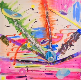
It was a warm day in late spring, pollen and tiny moths were falling so I placed one of the surfaces on an outdoor table under a shelter. I prepared the surface, and began dripping various colors, seeing in my mind's eye shapes, forms and color fields. I dripped both continuous paths of enamel, and small drops of enamel. I then poured large fields of bright enamel color to various sections of the painting and the result was exciting and dynamic. Since it takes enamel fields a long time to dry, I left the first piece outdoors until it could be moved. During the hours it was drying some of the pollen that was falling adhered to the paint (luckily no moths adhered.) The resulting painting
Pollen in Plein Air (salute to the many artists who work outdoors "in Plein Air) is one of the most exciting of my works. It was the first piece prepared for the "20 Women Show." This is it:

Pollen in Plein Air (48x48)

In a period of one month I turned out a suite of paintings, using different colors and sizes as well as themes. I chose six of these pieces for the show -- what follows is how they were hung and all of the pieces in addition to "Pollen."

How the Show was Hung

Whirls Away (48x48)

Joy (24x24)

Summer Splash (36x24)

Dream State (24x18)

Bleeding Heart (17x21)


December 7, 2009

Developing a New Artistic Voice in 2009

As you can see from this blog, my art has been developing in stages -- starting with abstract color fields, experimenting with muted colors and over-washes, inspired by a trip to India with my Sari Series -- abstract representational pictures capturing the colors and moods of India, experimenting with encaustics by using wax and color powders, and at the beginning of 2009, I developed an approach which used drip on a dark background on paper. These initial drip paintings follow and there was interest in them at the Springs Improvement Society exhibit at Ashawagh Hall in East Hampton and one of them sold.

Gloomy Monday

Gloomy 2


August 4, 2008

Participating in "20 Women Artists Show' in Ashwagh Hall

For over 100 years, Ashwagh Hall has been the cultural center for art in East Hampton NY. Artists that have exhibited there include Jackson Pollack, Willem De Kooning, Lee Krasner, Jimmy Ernst, Ian Hornack, Robert Motherwell, Robert Indiana, Claes Oldenberg, Hans Kline and Fairfeld Porter, among others.

All of them gathered there, displayed there and argued their various philosophies of color and art. There are art shows at
Ashwagh 52-weeks a year where many new artists in East Hampton -- still gather and share techniques.

On June 13, 2008 I was part of a show produced by Vito
Sisti called "20 Women Artists." I decided to feature my most recent work, my representational abstracts based upon by trip to India that I call my Sari Series for short. Many of these paintings are shown in my previous post.

Here are some photos taken at the show:


Arriving at Ashwagh Hall

Me at the show

With noted abstract artist, David Geiser

With my Son-in-law and Philadelphia photographer,
Harry Roth, Esq.
Harry helped me hang the show

With my son David Heller and daughter, Dr. Lisa Heller Roth

With my daughter-in-law Melissa Smith Heller & Harry


March 30, 2008

A Trip to India

Part of the reason you have not had a recent post to this blog is a trip I took to India for three weeks last October and November (and 3 more week to recover from jet lag and a bad drug interaction.) The Indian visit was one that I will never forget.

It's not just that India was a different culture to me, but it was an experience that required all five senses -- what materials and objects I touched, the smells of the spices and streets, the sounds I heard, the tastes of the food and of course, the sights I saw.

One notable visual aspect of Indian life is the colors of the Sari -- the universal dress of Indian women. Women are given many Saris by their family before they are married. The Sari is not just for "dressing up." We saw women working in the field, carrying manure for fuel, eating in a fancy restaurant, socializing -- all wearing beautiful and colorful Saris. And there are virtually an unlimited variety of colors (although some younger women will wear similar Saris as a school dress.)

Although, as you can see from my work, I have been painting abstract impressions of what I experience, I was intrigued with how I might reproduce my visual experiences of Indian women with Saris. I started painting a "Sari Series." In these canvases, I have been able to maintain some abstract images with representations of the women I saw and their Saris.


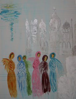
Saris at the Taj Mahal


Saris at School


Saris at a Market


Saris among Palms


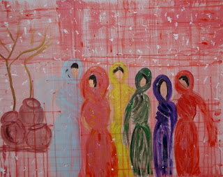
Saris at the Milk Market
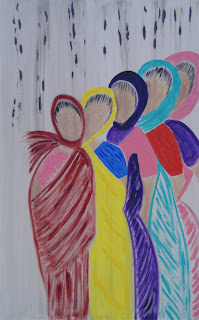


The two most recent paintings in this series are large 50" by 30" canvases. Those who have seen them are excited by them, as I am.

Nine Saris

Saris in the Sun

As memories of the trip continue to arise I may do more of these, although I still spend time on my abstract subjects -- as this recent painting called "Through the Glass Lightly" is an example of.


August 31, 2007

My First Commission

During July, I was asked by a client to create a large painting for a specific room. The room had a wood floor and an inviting fireplace. The painting was to go over the fireplace. In considering a piece to fill the space, I was reminded if a recent trip I had taken to Paris in April.

The sun was shining, and we went into a famous brasserie and was struck by the colors that set these spaces apart from other eating places. I developed several impressions of these colors in small studies. The wooded bar, the bright red colors and the combinations worked well in the space for which they were designed. One of the impressions was chosen by my client. It was done as a 24" x 36" acrylic on canvas. Here it is:


French Brasserie

July Work Explores What Makes an Abstract Figure Look Like Eastern Art

During the month of July, I became excited about experimenting with a softer palette, one that uses bright but aqueous colors in different context. I tried to mute the canvases of these works and everyone told me that they reminded them of Japanese and Chinese Art -- but with completely abstract figures.

Here are several examples of these works:

Happy Day


Asian Feeling


More Development in June

Now that I am painting in larger time blocks, I am able to explore how to create effects by use of the brush and colors. I have always been impressed, in realistic art, by how the artist is able to create the effect of a veil or lace by painting a light overcolor on a figure.

In abstract art, we have our own lace or veils by way of the window, through which we see the shapes. Not all windows are clear. Indeed if you look at most of the windows you see in real life, they are cloudy or dusty and the prettiest scene is often seen through an imperfect glass.

Several of my works were strong and impactful shapes but even these might be viewed or toned down by the barrier through which they are seen. Here are several of my pieces painted in June. Notice how the painted "veil" imparts new and different meanings the the works.


Through a Stained Glass


Under The Boardwalk

June 7, 2007

May 2007 was a productive month

During the month of May, I plunged into my work as never before. I've been exploring a number of approaches of combining colors and various media. Inspired by the recognition I received at the Guild Hall Members show, I became intrigued with the use of a bold background palette with abstract shapes representing bold contrasting colors.
As with abstract art, I apply these colors with a combination of planning and randomness. Planning in where I put he shapes -- randomness in how they are applied. Here are three examples:

Purple Sunsets

Explosion

On this canvas I added a geometric reference to my design with striking results as you can see below:

Hay Ride

May 11, 2007

Welcome to my Art Blog

This post is the first entry in a blog that will continuously be updated with new works as I complete them.

But first let me introduce myself. My name is Annette Heller.

Since the beginnings of my active life I've always had a flair for design, shape and color. But career and children always came first. In my spare time I took art courses and my work with the sculptor Ursula Witt yielded a number of acrylic sculptures which I still display in my home.

In addition to parenting, I received a degree as a school psychologist, and became a teacher and entrepreneur. When the kids left to high school I concentrated on my business career. I was time challenged especially holding down two jobs -- mother and business woman. But even in this career my sense of color and design came through in planning the decor of my offices.

While the kids were at school, I started a company called Art to Wear. I designed and made jewelry of all types and designs, learned the technique of "lost wax" casting and purchased a centrifugal casting machine to cast some of the silver and gold pieces. I sold jewelry at fairs and outdoor markets and several of my designs were purchased by Bergdorf Goodman in New York City and Nubest in Manhasset, NY.

Later in my life when the kids left home for college, I went into the consumer research business and designed a large consumer research facility where people gathered to express their opinions (Long Island Groups in Focus.) In my next career, I provided input into the design and colors of the snack food products of our family company, Harry's Premium Snacks.

When in 2002 we moved to East Hampton after selling our businesses, I started taking courses in art. I narrowed my choices in the beginning to oil and acrylic on various surfaces. I also chose abstract art as my mode of expression.

Why abstract? Because it is a representation of pure color, form and shape. But even more important, it is the only form of art where the viewer brings his or her perceptions into the art. Despite the fact that a specific painting may be a unique combination of colors and shapes inspired by real life moods and experiences, viewers tell me that they see many things in my art. Some say they see animals, insects, lighthouses, faces and in one case -- a piano. In all these works none of these objects were drawn, but the mood of the painting yielded the perception. I got tremendous satisfaction when one colleague suggested that one of my works represented a Parisian Bistro. So in a way I can represent a mood or feeling in an abstract work better than in a representational work. And also I can choose to work in an infinite variety of palate colors because I do not have to represent a specific object.

I began to enter my works into student and art exhibits and I have received much gratification. I sold a painting in my first exhibit. It is called Stormy Day.
Stormy Day
East Hampton is a marvelous artistic community. Jackson Pollack worked 1 mile away and Willem deKoonig lived 1/2 mile from my house. Hans Kline was a neighbor and friend before he passed on. David Geiser, one of the great abstract artists in the U.S. is a good friend and we share ideas (or rather I look forward to his comments.)

One of the major exhibits in East Hampton is the Guild Hall members show. This year was the 69th annual show. Imagine my satisfaction when my painting "Summer Dream" was judged the Best Abstract in the show by Faye Hirsch, Editor of Art in America.

Summer Dream
So this diary will update readers on my work and artistic growth. In the following posts I will share with you my work as it evolves. Comment on them if you would like and if you need to talk to me, feel free to send me an email.