This post is the first entry in a blog that will continuously be updated with new works as I complete them.
But first let me introduce myself. My name is Annette Heller.
Since the beginnings of my active life I've always had a flair for design, shape and color. But career and children always came first. In my spare time I took art courses and my work with the sculptor Ursula Witt yielded a number of acrylic sculptures which I still display in my home.
In addition to parenting, I received a degree as a school psychologist, and became a teacher and entrepreneur. When the kids left to high school I concentrated on my business career. I was time challenged especially holding down two jobs -- mother and business woman. But even in this career my sense of color and design came through in planning the decor of my offices.
While the kids were at school, I started a company called Art to Wear. I designed and made jewelry of all types and designs, learned the technique of "lost wax" casting and purchased a centrifugal casting machine to cast some of the silver and gold pieces. I sold jewelry at fairs and outdoor markets and several of my designs were purchased by Bergdorf Goodman in New York City and Nubest in Manhasset, NY.
Later in my life when the kids left home for college, I went into the consumer research business and designed a large consumer research facility where people gathered to express their opinions (Long Island Groups in Focus.) In my next career, I provided input into the design and colors of the snack food products of our family company, Harry's Premium Snacks.
When in 2002 we moved to East Hampton after selling our businesses, I started taking courses in art. I narrowed my choices in the beginning to oil and acrylic on various surfaces. I also chose abstract art as my mode of expression.
Why abstract? Because it is a representation of pure color, form and shape. But even more important, it is the only form of art where the viewer brings his or her perceptions into the art. Despite the fact that a specific painting may be a unique combination of colors and shapes inspired by real life moods and experiences, viewers tell me that they see many things in my art. Some say they see animals, insects, lighthouses, faces and in one case -- a piano. In all these works none of these objects were drawn, but the mood of the painting yielded the perception. I got tremendous satisfaction when one colleague suggested that one of my works represented a Parisian Bistro. So in a way I can represent a mood or feeling in an abstract work better than in a representational work. And also I can choose to work in an infinite variety of palate colors because I do not have to represent a specific object.
I began to enter my works into student and art exhibits and I have received much gratification. I sold a painting in my first exhibit. It is called Stormy Day.
Stormy Day
East Hampton is a marvelous artistic community. Jackson Pollack worked 1 mile away and Willem deKoonig lived 1/2 mile from my house. Hans Kline was a neighbor and friend before he passed on. David Geiser, one of the great abstract artists in the U.S. is a good friend and we share ideas (or rather I look forward to his comments.)
One of the major exhibits in East Hampton is the Guild Hall members show. This year was the 69th annual show. Imagine my satisfaction when my painting "Summer Dream" was judged the Best Abstract in the show by Faye Hirsch, Editor of Art in America.
Summer Dream
So this diary will update readers on my work and artistic growth. In the following posts I will share with you my work as it evolves. Comment on them if you would like and if you need to talk to me, feel free to send me an email.


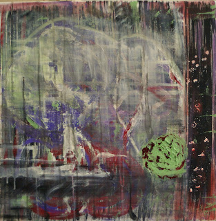
 Under The Boardwalk


